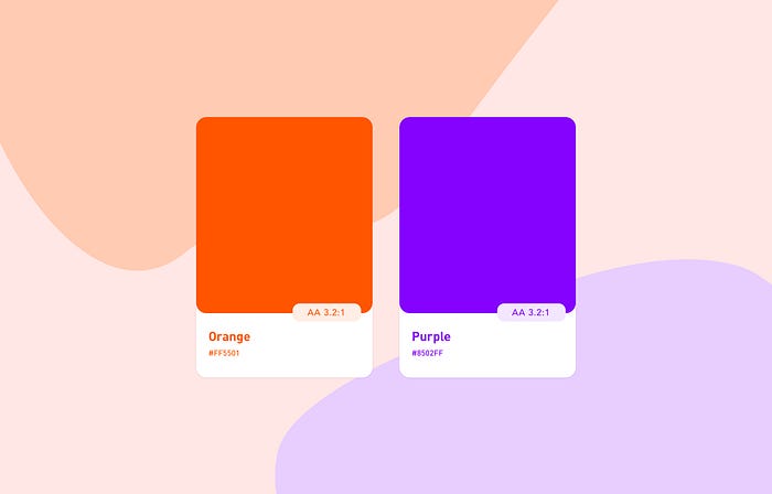
Colours for Accessibility: A mini Case Study 2/2
This year a topic I would like to advocate for as a designer is the one of accessibility. I would like to share my experience in creating an accessible colour system for a service or product.
Following my last post, what about sustainability? Reducing inequality on the web is one of the aspects. We can achieve it by empowering and promoting the social, economic and political inclusion of all. This is irrespective of age, sex, disability, race, ethnicity, origin, religion or economic, or another status. One of the aspects is Accessibility. By following WCAG standards, we can make the web a better place.
Designers have to handle different requirements when building a product. Educating clients about the importance of accessibility can be challenging. With the new rules from the European Union coming up, it could happen that brands or clients won’t react to them unless enforced. Unless enforced, they don’t focus on accessibility. They have to be business requirements to do so. How can we as designers change this dated mentality?
Following on the colour topic, I will dive deeper into why they need to have visual accessibility. This is how they provide a user experience that is welcoming to everyone.
Accessible Colour Palette
Within the introduction in the first part of this short case study, I mentioned established companies going digital. I brought this to set an example on the challenges they face, as opposed to the newer companies.
Established brands either understand that change is a need or they are reluctant to it. Within their reluctance lays the problem. Not all colour combinations of the brand will work on the web when it comes to accessibility. Accessibility on the web or digital services is an important topic. It is part of the user experience, sustainable design, and inclusivity.
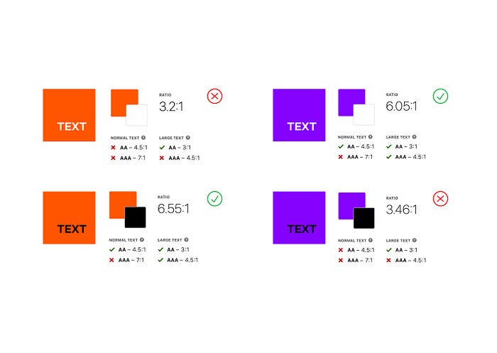
Once you have your sequential palette and have a colour system in place, run accessibility tests. This is the iterative part of the process to review the level of accessibility your colours have. The primary, secondary, and semantic colours result in the combination of text and background. This is the combination of the different sequential colours against the neutrals.
Achieving Accessibility
To achieve accessibility, there are two standards you will have to achieve. Level AA (recommended) and Level AAA (depends on the target).
Level AA
It needs a contrast ratio of 3:1 for large text (18pts). Or 4.5:1 for the smallest text size of 16pts (an exemption is a logo, for instance).
Level AAA
It requires a higher level of contrast 4.5:1 for large text and 7:1 for 16pts text.

Combining dark and light levels with 4 steps between will provide you with the necessary contrast to conform to web accessibility +AA standards. As an example, to have text on the screen (Purple500) on a light background (White000) passes level AA in theory. That is because it is above the minimum contrast ratio required (5:1).
You will have to test your different shades against black and white to define the level of contrast. This affects the typography contrast, for instance. If you are not using white or black, use the light or dark shades you have chosen for typography instead.
Depending on the hue or saturation, it will leave you with less room to play with colours if you have a design vision. If you want to learn more about colours and luminance, Mozilla has an introduction to colour and accessibility that will help you dive deeper into why you may encounter issues.
The accessibility of the colour orange
Not to make things more complicated, but I must add that WCAG requirements are not always optimal. Some colours, such as certain shades of blue and orange, work better combined with a colour that doesn’t achieve the level of compliance. This is because of the high luminance contrast, in this case, of white text. White is pure luminance, which makes it the strongest form of contrast. UX movement expands on the Myths of Colour Contrast Accessibility.
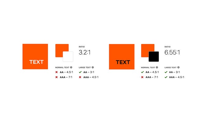
While white on orange is brighter and seems clearer than its black counterpart, black on orange has more contrast. The contrast ratio black on orange is 6.55:1 — reaching even the AAA level. The contrast ratio of white on orange is 3.1:1. Despite the difference, in contrast, orange and white combined appeared to work. If you squint your eyes to simulate blurriness and allow less light in, the white text on orange stands out more.

I have run a contrast check and a visual simulator test. On both, white on orange still appear brighter due to the hue of the orange and the luminance of the white. The luminance of white text doesn’t always get taken into account by WCAG. White is a pure colour, with the strongest form of contrast. This is why it appears easier to read than its black counterpart.
At this point, the colour has created a compelling argument. It is the designer’s choice to make a judgement on what works best. Running a qualitative test could confirm if white on orange is indeed better than what WCAG advises. Or, an A/B test could help decide on the best choice. UX movement takes on accessibility myths, while bounteous has a deep dive on the colour orange.
This part of the process will challenge you to find a good level of visual creativity. You will aim not to divert from your established brand image. At the same time, you will need to stick to a functional design that invites as many people as possible to use it.
Semantic colours
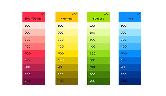
Semantic colours provide meaning as per their function. This is based on the expectation of the usage of such said colour. These colours are used occasionally to set an intention. If these colours are being used too often, they can create visual loudness. This can result in a confusing experience for the user.
These colours should also be tested for accessibility to meet level AA at least. Semantic colours should be harmonious with your primary colour. They need to match the initial palette as well. One can achieve this by playing with the hues.
States
There are some states, such as Focus, Active, and Hover that help with accessibility. These include:
Focus
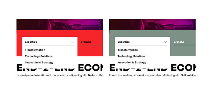
Focus states draw attention to a certain element. Those using navigation aid profit from this state. While browsers come with a default focus state, one can override it. Hence why this state needs to be checked for a good contrast to ensure accessibility. Focus states need to have at least a 3:1 contrast ratio against the background colour. They can be a border, background, or within a button.
Active
With an active state one is able to see that the element is currently active. They were successful in using the element. This state should be noticeable and more subtle than the hover state.
Hover
Hover states make the user aware that the element is interactive. Since the user is more than likely aware of where they are, the colour change can be more subtle than the focus state.

Shapes and Patterns
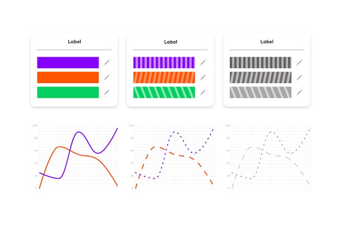
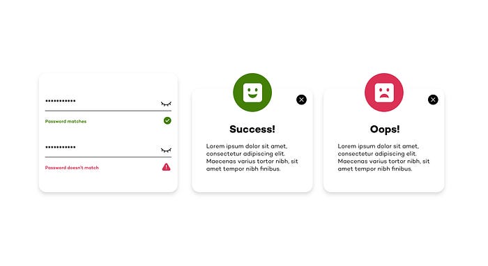
Applying a colourblind approach to your designs will help colorblind individuals. Colourblind individuals will be able to distinguish between colours when applying texture or patterns. They won't fear colour influencing their perception. Trello has a Colorblind Friendly Mode for this. Communication shouldn’t rely on colour only. When using semantic colours use other visual cues for enhancing the communication patterns.
Colour + Shape
Colour + Icon
Dark Mode
When creating your dark theme palette, your initial colours might not work against the background due to their saturation. If they are too saturated, they will lose contrast. Why are desaturated colours necessary? This is because desaturated colours will allow more contrast. They are more luminous against the dark backgrounds. Saturated colours fail WCAG’s accessibility standards of at least 4.5:1 for body text against dark surfaces.
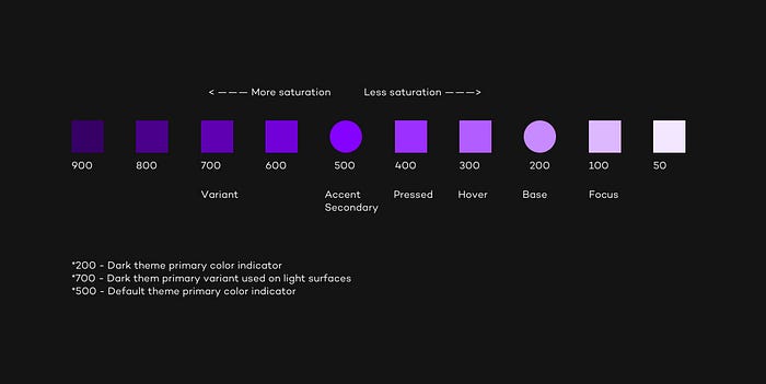
Dark mode also brings other issues to the table. People suffering from astigmatism or myopia will encounter problems with this mode. User experience expert H. Locke notes that dark backgrounds can cause a “halation effect” for users with astigmatism. Darker displays cause the iris to open to receive more light. For people with astigmatism, this can make focusing more difficult. Navigating with a keyboard might also be difficult with this mode. The visual cues for the focus state might not be strong or distinguishable enough.
On the plus side, dark mode reduces blue light exposure and cuts glare. This helps decrease eye strain. This post by The Wire has a list of some of the benefits of Dark Mode. Thankfully, more interfaces are now giving users the preference between light and dark mode.
Accessibility Checker
These are some online tools that will help you check for contrast when designing. There is also a plugin for Sketch and Figma called Stark. They help to check if your product is accessible and compliant. Or, Cluse is another tool that can help you check for contrast when using Sketch.
What colours are bad for accessibility?
The most common form of colour blindness is known as ‘red/green colour blindness. Most colour-blind people have one type of this. Means they can mix colours that have some red or green as part of the whole colour.

Let’s cut to the chase, these colour combos should be avoided:
Avoid red and black combinations. People who cannot detect red will confuse red and black, so the item will not be legible.
Avoid red and green combinations. Approximately 5% of people cannot distinguish between red and green.
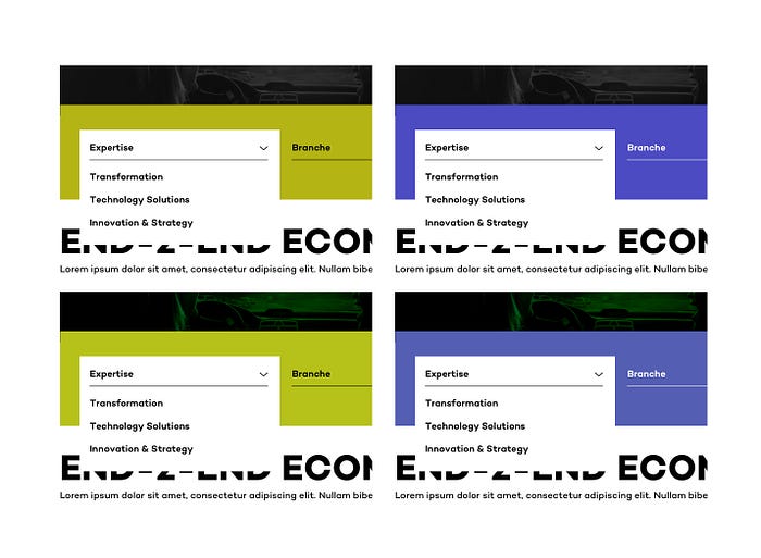
Facts: Colour blindness affects approximately 1 in 12 men (8%) and 1 in 200 women in the world. There is general agreement that worldwide 8% of men and 0.5% of women have a colour vision deficiency.
The most common types of colour blindness are those in the red-green category. In the colorblind population, deuteranomalous (or green-weak) vision is by far the most prevalent. The official breakdown is as follows:
- Protanopes 12.5%
- Protanomalous 12.5%
- Deuteranopes 12.5%
- Deuteranomalous 62.5%
“ Statistically speaking most people with a moderate form of red/green colour blindness will only be able to identify accurately 5 or so coloured pencils from a standard box of 24 pencil crayons. “ — Color Blind Awareness
Findings and final thoughts
- To find semantic colours, one has to adjust them to match the hues of the main / default colour. Yet, to have an aesthetically pleasing and accessible colour palette, these colours need to be adjusted in saturation/light to match both the palette and accessibility levels.
- There is no 1 to 1 dark-mode palette. If we start designing on the light mode, then the dark mode colours could need adjustments. Only then they will have a different lightness degree and enough contrast.
- Colours in light themes need more saturation and colours in dark themes less saturation to have higher contrast and reach AA levels.
- Choose a colour system, not a colour palette. This will be beneficial for the UI as it is part of the foundation.
- Start your design (products or services included) with a clear understanding and intention. Don’t add accessibility towards the end of the process to simply protect the business. For this type of thinking, you have already failed.
Change can’t happen overnight. Clients might come with excuses and predicaments on why sustainable design shouldn’t be included. But if you start early within the process, you are already a step closer in the right direction. And who is responsible for ensuring the design is ethical? In short: we all are.
Thanks for reading ✌🏼
Sources
Colour Blind Awareness
https://www.colourblindawareness.org/
All about Vision
https://www.allaboutvision.com/conditions/color-blindness/types-of-color-blindness/
National Eye Institute
https://www.nei.nih.gov/learn-about-eye-health/eye-conditions-and-diseases/color-blindness/types-color-blindness
Stark
https://www.getstark.co/library/collections/making-accessible-color-combos/
Article: A guide to colour accessibility
https://medium.com/handsome-perspectives/a-guide-to-color-accessibility-in-product-design-aa3e8919be0
Invision
https://www.invisionapp.com/inside-design/color-accessibility-product-design/
W3.org
https://www.w3.org/WAI/WCAG21/Understanding/use-of-color.html
https://www.w3.org/TR/UNDERSTANDING-WCAG20/visual-audio-contrast-without-color.html
Mozilla
https://developer.mozilla.org/en-US/docs/Web/Accessibility/Understanding_Colors_and_Luminance
UX Movement
https://uxmovement.com/buttons/the-myths-of-color-contrast-accessibility/
Harvard.edu
https://accessibility.huit.harvard.edu/use-sufficient-color-contrast
StephanieWalter.design
https://stephaniewalter.design/blog/color-accessibility-tools-resources-to-design-inclusive-products/
Article: Making a palette accessible
https://medium.com/sketch-app-sources/making-a-palette-accessible-554694dcf037
Bootstrap.com
https://getbootstrap.com/docs/5.0/customize/color/
Colormind.io
http://colormind.io/bootstrap/
Graphicdesign.stackexchange
https://graphicdesign.stackexchange.com/questions/43021/what-exactly-are-googles-500-color-swatches
Material.io
https://material.io/design/color/the-color-system.html
https://material.io/design/color/text-legibility.html#text-types
Prototyper.io
https://blog.prototypr.io/basic-ui-color-guide-7612075cc71a
Fiori Design Guidelines
https://experience.sap.com/fiori-design-web/how-to-use-semantic-colors/
Smashing Magazine
https://www.smashingmagazine.com/2014/10/color-contrast-tips-and-tools-for-accessibility/
Adobe Spectrum
https://spectrum.adobe.com/page/color/
toolness.github.io
https://toolness.github.io/accessible-color-matrix/
Colorable.jxnblk
https://colorable.jxnblk.com/2a0066/00ffc8
Bureau of Internet accessibility
https://www.boia.org/blog/dark-mode-can-improve-text-readability-but-not-for-everyone#:~:text=User%20experience%20expert%20H.,can%20make%20focusing%20more%20difficult.
